I conducted a quick TA research where I printed out my latest drafts of each of my magazine page to get some last minute opinions. I sent the copies around my class and told each table to write what they thought about them. Below are my latest drafts and what people had to say about them.


According to the responses I got back on this sheet they were all quite positive besides some few minor changes I may have to make. The first comment suggest having the barcode at the very edge of the front cover but I'm not sure how I would be able to do that without taking out the banner at the bottom of the bottom of the page. I could move it slightly more to the left but other than that I'm not sure where else it could go without changing the layout of the page. The shape of the social media (CMC) logos are just a minor detail and when I asked my audience if it would put them off buying the magazine they all said "NO".
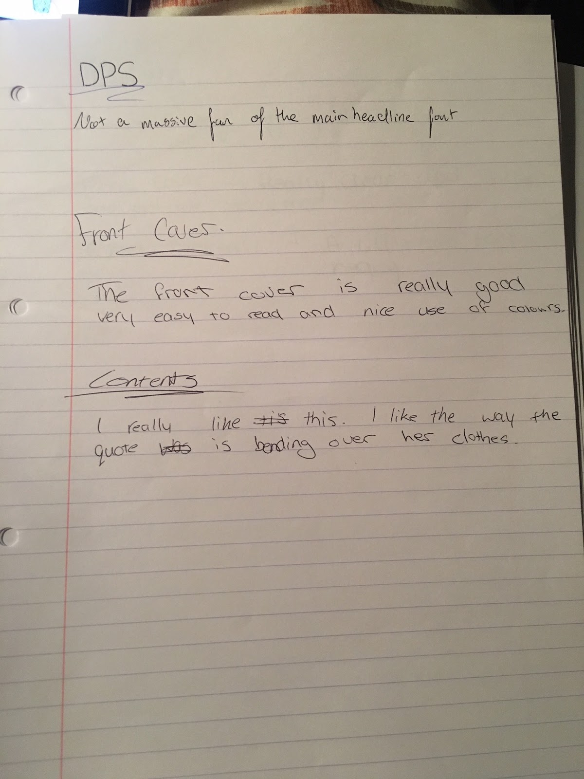
As for the DPS, I think I am going to remove the red box at the top of the page which would indicate that this page is the cover story. It is not necessary as not every magazine has one, I just thought it would add a bit more synergy to my DPS and showcase the red 'house style' of Countrypolitan.
Another person said that they weren't impressed by the font of the title on my DPS. I might change this, however I personally really liked it since it is a handwriting font which is very unconventional for a DPS but adds a personal touch. It also adds synergy since the same font was used on the front cover.

No comments:
Post a Comment