Yesterday, I conducted a focus group made up of 10 (5 boys and 5 girls, ranging from 16 to 19 years old) people to find out what my TA think about my magazine and to gather their ideas on what I should do differently/change. I showed them my hand drawn drafts of each three of my pages to they could understand what feel I was trying to achieve with it. The results were as followed:
1. I’ve
been told that Countrypolitan sounds very similar to the gossip magazine
Cosmopolitan which has a target audience of women around the age of 30 years
old, do you think this will discourage young people or men to buy it?
Yes = 2
No = 8
When I asked the "Yes'" why, they said that boys might be embarrassed to buy a magazine so similarly named to Cosmopolitan especially if they look alike. This means that I will have to make it clear that I have a target audience of both genders and show that there are a lot of awesome articles that they would enjoy too.
2. How
does my cover image make you feel about the magazine? Who do think would buy it
based on how it looks?
"The banner in the middle looks a bit random but it still looks better that not having one at all, 'cause it's pink girls will probably be more drawn into buying it"
"I like it and it gives off a positive vibe. It looks like it would be a Spring Edition"
3. I was thinking about having a banner going across Brittany’s shoulders but I
don’t know what to put in it, what is something important that you would like
to see in the magazine that could be put in the banner?
"Maybe a quote or a song lyric"
"Yeah I agree with Robbie, 'cause usually magazines have a slogan or quote next to the artist so it'd be cool"
"I like the idea of a song lyric"
"Concert information maybe? I don't know"
"Something relating to your DPS so it creates synergy... have it in the same colour or font too"
"Tour dates"
4. Do
you understand what the cover stories are going to be about or should I change
them so they all focus around music?
I understand them = 9
They confuse me = 1
The person who was confused by the cover stories said "I understand them but I just don't get what 'Life on the Plains' has to do with music, the same with 'Where to go and what to wear', it seems like they're titles that fashion magazines would have on them, not music magazines."
5. Is
£5 too expensive for a magazine (taking into consideration that it is going to
be very high quality)? What about £3?
"Obviously the cheaper the better"
"I don't want to pay a lot of money for something that I'm probably only going to read once"
"I buy Vogue and thats like £5, sometimes higher so if it was going to be chunky then yeah sure"
"£3 is more realistic to be honest"
6. Do
you think that my contents page looks a little bit too blank and if so, should
I have an actual photograph of a field covering the whole background instead of
it just being white?
"I kind of like how simple it looks"
"Me too, I've never really read a magazine that has a contents page with an actual photograph as the background"
"It does look a bit blank, but I think when you get a bit more writing on it it should be fine"
7. Would
you rather read something that is formal or informal?
Everyone I asked said that they would like to read informal magazines and preferred "conversational" articles because of how much easier and more encouraging to read.
8. What
would encourage you to read a full double page spread? Large text? More
pictures?
Large text = 1
Many photos = 2
Attractive people = 2
Well known bands = 5
9. Would
the use of lace or wood look better on my cover, contents and DPS?
Lace = 4
Wood = 6
*NOTE: All of the boys said wood and all but one girl said lace*


 I've been using the Dodge Tool with the Range "Midtones" in order to get rid of any unwanted shaddows. I asked a few of my classmates which photo they preferred out of the two pictures to the left and they all said that they liked the bottom one the best. This is because the shadows took their attention away from Brittany's eye (which is the main feature of this photo).


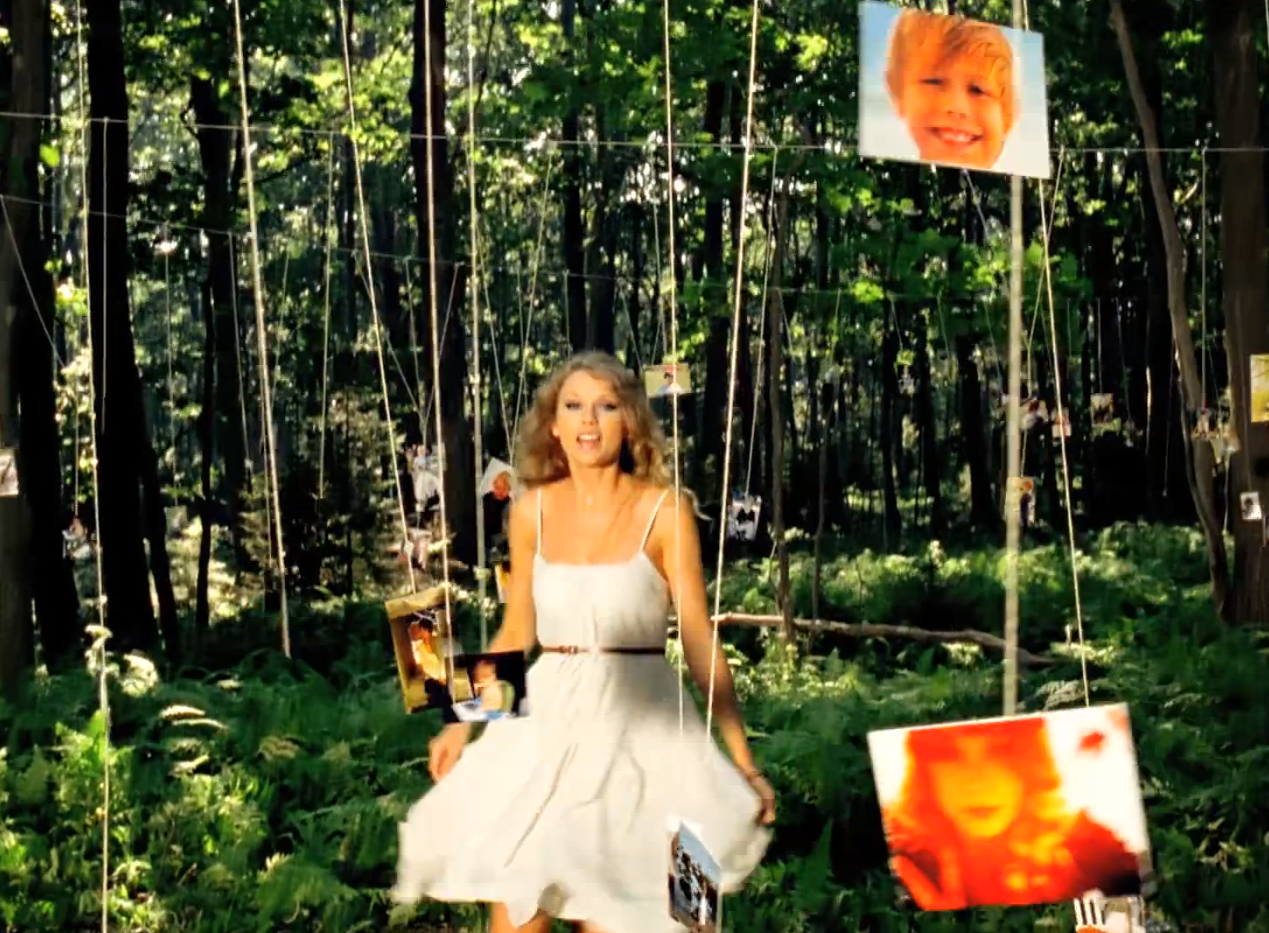

 My plan for this photo shoot is to help my target audience see a bit more of the graceful side of country music, and by incorporating lace and pearls I think I can do just that. I have two models for this shoot which means I can use so many new poses. We are going to an abandoned farm after 6th Form which i think will be a great location to shoot at as it is easy to get to and adheres to the conventions of the country lifestyle. In the second hour Amy is leaving and me and Brittany are going to a forest (bearing in mind it will be darker since she sun will have gone down) to take some more pictures. I got some inspiration off of Taylor Swifts music video "Mine".


 This magazine is a Billboard Spring edition which features Katy Perry wearing a black floral dress as she is ambushed by Gerbera flowers. Not only does the season of the magazine determine the colours and clothing used on this cover but it also indicates the target audience for this particular magazine. Due to the predominant colour being pink not as many "rugged traditionalist" men will purchase it. This is all due to how people choose to present themselves, for example, although some of the men might enjoy the contents of this magazine like what's in the features and photographs, they wouldn't want to be seen purchasing it since it wouldn't adhere to their image. On the other hand teenage girls from the ages 15+ would instantly be drawn to this cover since it is almost entirely pastel pink. It looks very fun with the use of the transparent, circular puff which makes it appear ultra modern and bubbly. The masthead of Billboard Magazine shows off more of the pop side of the music industry as it is in a serif font and the 'b' 'a' and 'd' are all filled in with the primary colours. In my opinion, the cover story is also aimed at the female half of the population as it offers an insight into "The Court Of The New Queen Of Pop". By using the word "Queen" it triggers people to think about female superiority (a topic which most women would be proud of and therefor want to read). Everything on the page is neat and in place in terms of feature stories and puffs which is stereotypically what the traditional woman prefers.


 The words used are quite lustful which draws in people who read magazines for entertainment. The colours used are also classed as being quite masculine which further lures in the male TA.
 It seems that BBC's Music magazine is trying to attract an older audience by they way its page is laid out and by the images they used. Usually the model they use on the front cover is a huge indication of the age, class and sometimes gender of its TA. The cover is the main selling point as it is the first thing consumers see on the shelf in a shop. By having the famous pianist's name "HOROWITZ" in bold it helps the people notice it much faster and will probably be the first thing they will read. As this front cover features Vladamir Horowitz, an deceased piano "genius", people who know his music or who have grown up listening to his classical pieces are more likely to be persuaded into buying it. He must have quite an old TA as he died in the 80's, which will therefore affect the magazine sales. Horowitz is also very famous for composing for different moves so students who play piano or appreciate the arts might also find this magazine interesting to read.
  There is also a small symbol on both sides of the title which makes the magazine appear that a lot of time and preparation was spent producing this magazine which people who look for quality in a magazine would appreciate.
 It also seems like quite a high class magazine as well since the mast head is in a serif font which is normally a sign of being classy and high quality. They use a variety of different fonts with a range of sizes to make it easier for its audience to pin point a story that they might be interested in reading. The buzz words in this text box located tin the middle of the page are in a bright red colour which contrasts to any other colour on the page. Elderly people stereotypically like cheaper things and are constantly on the look out for a bargain so this really helps sway the consumer to buy this product. Not only are the words "PLUS" and "FREE" in red but they are also in capitals and use an exclamation point to let people know that this is important.
 I've found out that most magazines (no matter what age, gender or class) incorporate many sizes, colours and fonts in the writing on their front covers. No matter who the target audience is, the institutions still need their magazines to stand out in order for them to be sold and using these techniques will increase the change of the magazine being noticed in a shop. thus increasing their sales. Some of the features that the TA influences is the specifics like the pose of the model, the types of fonts used, the key words used, and the positioning of the texts.


