Rejections:
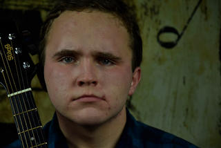
I wanted to capture some good long-mid shots of Joe but his facial expressions in some of the pictures weren't displaying the rugged, "tough-guy" image I wanted him to be portrayed as. In the photo above he looked more bored than aggressive and his posture in this pose wasn't my favourite.
At first glance I really liked this picture and I think it looks quite aspirational which would certainly appeal to the aspirers from my TA, but The neck of the guitar isn't completely in the shot and you can see a prominent glare in Joe's glasses which reflects everything from behind the camera. This would be very difficult to edit out in Adobe Elements and for this reason I won't be using it on my contents page.
This photo didn't fit Joe's image either as he looks too casual and doesn't really look like a well known star. I think this was due to the pose and camera angle which the photo was taken in. As it was a mid shot taken at eye level it didn't really give Joe the image I wanted. In addition the lights were not in the right position so one of Joe's eyes look very dark and you can clearly tell that this was just a rushed photo that I improved. I also did not use the rule of thirds, this could easily be cropped and fixed on Adobe Elements however it would take up time that I could spend on doing other things. It would be much better to choose a higher quality photo.
Selections:
My main goal with incorporating Joe into my magazine is to reach out to the Rugged Traditionalists in my TA so that they recognise that this is a serious multi-gender magazine which applies to them as well. In all of my favourite photos from this shoot I believe that the image Joe is portraying has made it apparent that this is also a "manly" magazine in which the male population can buy too.
The light on Joe's left has been set further back than the one on his right which created this amazing shadow effect and comes across as quite mysterious. I think this could make a great photo for my contents page which advertises another article within the magazine. Since only one half of Joe's face is distinguishable I think that this will add to his star image of being a perplexed man who people will want to read/find out about.
This photo is very dark (as of the rest of the photo's from the shoot) so I will have to adjust the light levels on Adobe but I think it works in favor of this image. It first glance, Joe looks like he's in deep thought which my TA would find intriguing and might like to find out more which will encourage them to buy the magazine to read his article.
This was one of the better long-mid shots I got from this shoot where Joe is making direct eye contact with the camera. His checkered shirt, brown belt, suede jacket and guitar are all typical signs of the Country and Western genre so it would be conventional to have it on my contents page. He is in a confident pose and my audience should notice that he is portraying a well known star.
Although this photo is similar to the previous in terms of lighting, props and his pose, I told Joe to look more serious and to turn his body to face the camera more. By doing these subtle adjustments it changed the whole mood of the photo, so instead of looking curious like the photo before, he looks slightly more dominant. This is due to the angle of his body and the direct glare into the camera. His hand is also clenched into a fist.


No comments:
Post a Comment