Wednesday, 19 October 2016

Photo Shoot 2

These are a few of my favourite photos from last nights photo shoot along with some examples of pictures that I will not use. I have created a Slidely to show all of the photos I took during the photo shoot as well which I added to the end of this post.

In my opinion this photo is one of the best pictures I captured as it contains three strong representations of the genre Country and Western (the belt, the banjo and the boots). Her pose is relaxed as she 'sits on her hip' which gives the idea that she is comfortable and the picture was taken in a relaxed environment.

Another one of my favourite shots from last night! This photo accentuates Brittany's eyes and the lighting is great as well. However I didn't plan to actually get her hand in the photo so if I choose this to be featured in my magazine I might have to use photoshop on her thumb nail to make it seem polished so it shows that she is a big Country star.


This shot was taken on the ground which makes her look quite laid back. I especially think that her hair and makeup in this shot are how I want them to be seen in the magazine.

This was the first picture I took where the model wasn't smiling. I think it would change the whole tone of the magazine if I incorporated this photo. Since she isn't smiling it looks less inviting than some of the happier photos I took, however it still works very well as she looks rather high fashion and her eyes are widened. Girls in this generation look up to people in the media who use poses like this because it shows off their confidence and makes them look fierce, for example Beyonce in her "I Am Sasha Fierce" album or Miranda Lambert in her "Gunpowder and Lead" photoshoot (as shown below).
Beyonce (I Am Sasha Fierce)
Miranda Lambert (Gunpowder and Lead)


Although Brittany's face isn't shown in this picture, breaking conventions, I do think it's cool how you can see the motion in her shawl.
This picture is a bit like the previous one however the shawl is static and Brittany is now facing the camera. This would be a good photo to use because I think it was successful in representing being liberated and proud. This would further change the tone of my magazine, thus adding diversity into what I could write about on my double page spread.
This facial expression is similar to one of the previous ones but she looks slightly smug instead of looking fierce, this is due to the tilt of her head and slight smirk. It just goes to show how big of a difference one slight movement can make to your photographs.

The lighting in this photo is all wrong in comparison to the pose as her face is very dark. I would've expected the lighting to have been much more fun and bright to compare with her sassy pose but this just didn't happen. However I do like this shirt as it adheres to the conventions of the genre.
I probably wouldn't use this photograph as it is blurry and the light is far too bright. As you can see it has burnt out their skin. However I do like the different facial expressions of my models since it shows a contrast in the personalities of their star images which appeals to most people in my TA.

Although this picture has many drawbacks like how it is very blurry and the background isn't very practical, it has inspired me to use the same pose in the next photo shoot I do. I loved working with two models instead of just one because it let me use a wider variety of poses.

Open Evening Photo Shoot by Slidely Slideshow

Research: DPS 2 (Bullet For My Valentine)


Domain: Tells the audience about their plan to take over the hard rock world. Informs and explains. Full of anecdotes.

Medium: DPS printed media in a music magazine.

Tenor: Light hearted tone but the reader still gets the feeling that they are serious about their careers. Informal tone from the writer.

Register: Informal Register.

Justification: Right hand side however it is text wrapped around one of the band members shoulders which breaks conventions.

How this has influenced my planning and creativity:

  • I think it looks great the way the picture spreads throughout the two pages.
  • I like how they used a pull quote.
  • I like that the background looks 3D since it is layered in front of the artists.

Photo Shoot 2 Plan


Photo Shoot 2 (Behind the Scenes)

The camera I used in this photo shoot was a Nikon D7200 DSLR (digital single lens reflex) fitted with a 35mm prime lens. I fitted it onto the tripod to get better resolution photographs. I found out that when I didn't use the tripod in the drama studio (when I was taking pictures of Brittany with Ryan) that they turned out too blurry that I couldn't even consider using them for and of the photos in my magazine. However the pictures I took in the classroom with continuous lighting with a soft box looked fantastic and I was over the moon with how they turned out! My teachers set up the white background and we watched how she did it so in the future we could try to do it ourselves.


One of the issues I found in the studio set up was that if I didn't have the camera in the right position the actual light was visible so I'd have to crop that out of the photo or use photoshop to edit it out (if I was that desperate to use one of those photos in my magazine). It was also pretty difficult to get a perfect image of Brittany flipping her hair as it was moving too fast to capture a clear image.

I learned a lot about photography in this shoot. How the camera is positioned (high angle/ low angle) really reflects how the star is portrayed. For example when I took a picture from a higher level than Brittany she looked more vulnerable than when I took a photo from eye level.

It was very easy working with Brittany on set because she is naturally outgoing and doesn't really care what people think (which was good as there were many people watching which would have otherwise added pressure). When I use another model I might have to direct them a bit more to find a creative pose. Ryan is naturally photogenic too so when he made an appearance in some of my photos it looked perfect.

Setting up the framing of my shots was quite simple just as long as I didn't go over the edge of the background area. There was a white tarp on the floor to camouflage with the white background which was great for when I took photos on the floor. This is going to make photoshopping the pictures so much easier as the edges/ outline of my model will be so much sharper than if I used a patterned background.

I'm still not really sure on whether I want Brittany to be smiling or serious on my cover picture so I got her to do a mixture of both during my time with the camera. A blank expression could look quite intimidating however it might be a good idea as it would look like a more modern representation of a woman (which is what I want in order to reach out to my target audience). Smiling, on the other hand would welcome the audience and give her a completely different image.

I did stick to my photo shoot plan for the most part however I found it hard to bring in all of the props because I had so many ideas I didn't really get to do everything since it would've taken so long. So I had to really adapt it for the practicality of the shoot.

In most of the photos I think I adhered to the conventions of a modern Country Music magazine. In a couple of the pictures I incorporated a sparkly silk scarf which doesn't really comply to what people usually do for the type of magazine I want to make, this broke conventions and make my photo shoot unique. To break conventions for shot types I brought in a stool and told Brittany to do a funny face whilst leaning on it. I wanted to capture a bit of the funny/ not very serious side of my star and I thought by doing a few silly faces will show my audience that even though she is a glamourous star she is still human like them. I did this in hopes to inspire the readers that they could get interested in Country Music too.

I used many different shot types including extreme close ups, close ups, medium close ups and long shots. Each of these shot types highlight a different part of my model, for example, the long shot accentuated the cowboy boots so if I use one of those images on my front cover they will act as a sign to show the audience that this is a Country Music magazine as it is a convention to the genre. The close up photos of Brittany's eye being covered by the suede shawl highlights her actual eye and shows the texture of the shawl. As Country Music and has a history with being associated with the Wild West the suede material (commonly used throughout most western movies) is an indexical sign which the audience will then immediately associate with Country Music. I also got Brittany to sit on the floor which I had to adjust the tripod for in order to get on the same level as her since I didn't want her to look inferior or vulnerable.

A wordle of some of the media terminology I was taught during the photo shoot.

Research: Target Audience 2

A few days ago I carried out a survey on Instagram where I got results for what type of font my target audience liked the most. All I have to do now is decide what I'm going to actually call my magazine. I made a poll on polldaddy.com in order to collect data from the public on what I should call my masthead. I will collect the results in a weeks time.

 I didn't get any results from this survey so I will have to ask around 6th form in order to get the results I need.

Most people chose Banjo or Countrypolitan. I asked them to chose their favourite font as well as the name. These two names stood out to me from the beginning but they would both have their perks and their downsides if they were to be used as my masthead. If I were to use Banjo I would have to take into consideration that some people might not know that it is a country music magazine but it might appear to them as a magazine primarily about instruments. The problem with Countrypolitan is that despite being the perfect name for my magazine, it is quite long. This means that I might run into some trouble when editing it as it would have to be so small for it to fit on the magazine (unless I break conventions and have it vertical instead of horizontal). It would also be difficult since one of the things I wanted to do was have the image layered on top of the masthead, and if the writing is too small then it wouldn't look right.


Photoshoot Makeup

The "before and after" picture (eye's closed)
The "before and after" picture (eye's open)
This was a photo I found on Google Images of
a girls eyeshadow which I tried to recreate with Brittany
Brittany's eyeshadow.


Monday, 17 October 2016

Audience Feedback from Instagram (Masthead Fonts)


I used Instagram as a way of getting opinions off of people my age (which is my target audience).


 After 24 hous I collected the results...

The feedback I got from 14 people showed that 5 people thought I should use the 5th one, 8 people thought I should use the 6th one, three people liked the 7th one and one person liked the first one. Since only one person only liked the first one I don't think I will consider this in my final masthead design. I think the fact that he is a boy who usually likes rock music (not country) could have influenced his decision in choosing which one he thought would be best.

Planning-First Ideas (Contents)

As well as including Brittany in some of the photos on my contents page (to create synergy by using the same model as the front cover) I finally persuaded two other close friends of mine to feature in a few of the photos on my contents. Amy and Amy-Jo are both blonde and are of similar height so they look like they could be made into the perfect girl duo in the Country Music industry.

Amy-Jo (left) and Amy (right)
I want the colours of my magazine to be very natural maybe with a hint of solid red (so it stands out). I like the idea of using red because whenever you think of a classic country and western barn it is always a bright red colour with white frame work as seen to the right. I could use photoshop to colour select the actual colour and use it when it comes to the titles and cover stories (from the front cover). This will create synergy between my pages.

I still need to find a male model who will act as a sort of "bad boy" in the country music industry.

Research: DPS 1 (Resurrection Man)


Planning- Initial Ideas (Front Cover)

For the photo on my front cover I was hoping to get a great long shot of Brittany possibly sat on hay bails in front of a tractor or in front of a barn. I'm incredibly lucky to live where I live because this means that I have access to the public walkways and parks in and around Barton. We have a field where we keep two horses so if I need a country style backdrop it will be perfect. The man who owns the field next to us is very good friends with my family and I'm sure it will be no problem if I ask him to use his farm as a background. He owns a few tractors and a hay shed. He also owns cows, pigs and chickens.

The only thing I'm worried about is that since it is October now the weather is starting to get a bit dreary and grey so it will be quite hard to plan the days of my photo shoots. I was imagining having warm tones as the lighting for my cover photo and as its winter I might have to adjust the lighting and contrast on Photoshop after they've been taken.

I am going to transform Brittany into a world famous Country star who is making her debut in Europe (UK) so I think I will have to change her name to suit the genre. This will support Dyers theory that "A star is an image not a real person that is constructed", so despite country not being Brittany's favourite genre of music, or the fact that she doesn't own a pair of cowboy boots wont matter because "How we are seen determines how we are treated... how we see 'them' comes from representation". This is where my banjo would come in handy. I'm planning on getting Brittany to hold my banjo in the cover photo which will be used as one of the main codes since it will be recognised by the audience so they know that this is a Country Music magazine and Brittany is a Country Music Star.

It would also be a good idea to adhere to Laura Mulvey's male gaze theory. I am going to get Brittany to represent a beautiful young woman who will catch the eye of my male target audience (since I want my magazine to appeal to both boys and girls) however I don't want her to look too revealing or indecent that she will give off negative connotations to girls. I want her to be a role model to younger girls.


Planning- Model Practice

This weekend I checked out a camera and a tripod so I could get an idea of how to use the equipment before the practice photo shoot tomorrow. Brittany was excited to help out so she came over to my house on Sunday and I just informed her about what I wanted her to do and wear when it comes to tomorrow. We spent the whole day choosing outfits and seeing what makeup would look best with the boots and clothes she would be wearing. I experimented with different angles and focuses on the camera as well as taking some pictures without the tripod so I could seethe difference in quality and to see for myself what effect it has on the outcome of the pictures. It was great to get to grips with how to use the zoom as well. However I still haven't mastered hot to take pictures of moving objects, as I found out when Brittany was on the swing that it is very difficult unless I'm moving with it.

Saturday, 15 October 2016

Masthead Ideas

I've been looking at what type of words companies use for their mastheads and it seems that they use words which are associated with the specific genre. For example, Mojo sounds quite vintage and the onomatopoeic Kerrang sounds sort of like someone strummed an electric guitar so it is perfect for a metal/rock magazine.


Words associated with Country Music that would make a good masthead:

  • Banjo
  • Countrypolitan
  • Set List
  • Western Magazine
  • Rural Magazine
  • Boots & Strings
  • Rhinestone Magazine

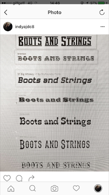
 Below are some fonts that I found that I could use for my masthead (using Boots and Strings as an example). Each font would bring a different vibe to my magazine so I would have to choose very carefully. The decision could even effect my target audience and the sales of the magazine because with a larges target audience I would get more sales. This is why I want to make my TA as large as possible by making my magazine unisex, meaning I would need to consider what style I should use for my masthead.


Friday, 7 October 2016

Initial Genre Choice


Conventions:

Masthead's in Country Music Magazines are usually red, blue or green. They probably choose red and blue not only because they are bright colours which stand out on plain backgrounds but because they represent patriotism of America as they match the US flag. Green is probably used to symbolise rural living. The size and the position of the Masthead are usually 1/6th of the front page however can also break conventions like Nash does in the image in the middle by having a square masthead.

Sepia and black and white have been typical of Country and Western Magazines but as times change "the idea of audience is changing, it's getting harder to conceive media audience asa stable group". McDougall's theory supports Country Music because not all Country Music fans are stereotypically old and Americal. Perhaps a younger audience prefers a spectrum of colours on the front cover but as shown in the image of Johnny Cash on the right it is black and white to appeal to his older audience since there are more older people who enjoy his music.

The amount of cover stories vary from magazine to magazine but there is always a prominent font (usually bold or in a different colour) to signify the main article.

Almost 100% of Country Music Magazines have feature stories about other artists either giving concert dates or giving them a bit of a biography. Some even advertise competitions you can win to get free concert tickets or trips to a state. There are also quite a lot of critics choice columns.

Puffs are rare within this genre there is usually only one which is very small. Puffs are slogans used to inform the reader of the popularity or quality of the magazine, like in Maverick they have a banner-like puff under the masthead saying "THE UK'S LEADING INDEPENDENT COUNTRY MUSIC MAGAZINE".

Pugs are a convention of any type of magazine and include the barcode in the bottom right; the price, date and issue number at the top; and any other little extras like promotions or freebies.

At the bottom of the Maverick magazine shown at the top of this post a banner is used which adheres to the conventions of a Country Music Magazine "Embracing the best of country, folk, bluegrass and roots music". This just advertises all the magazine has to offer. Usually the banners contain information such  as email addresses and web addresses and sometimes hash tags in modern magazines.

Pictures / Photography:

As there are many different types of singers and styles within the Country and Western genre there are many different ways to take a photo. Usually in a group picture they are spread quite far apart from each other whilst holding guitars or other acoustic instruments. Individual singers almost always have a specific sign in the image with them which tells the audience that their music is definitely Country.

Props are almost always used in shots which make the layout look more natural. By even holding a Stetson style hat instead of a mask or an electric guitar it shows straight away that the magazine will be of a more acoustic genre.

Costumes are usually simple however recently conventions of the classic country image are being changed so artists are wearing more casual clothes. Most of the time artists are dressed comfortably in blue jeans, check shirts and cowboy boots.

Desaturation is commonly used in sepia.

Fonts:

Handwriting fonts are not typically used in Country Music. Large block font is typical since it stands out. Sans serif fonts are used a lot besides Times New Roman.

Research Contents 1 (Acoustic Magazine)


How this has influenced my ideas and creativity:

  • I love the how even by adding the slightest bit of red to the contents page ties the whole magazine together.
  • I like how some of the storied have images to show the reader what is on that page without even reading anything.
  • However I don't like how plain it is, I feel like just using the red isn't enough. They should've added more colour to make it look less boring.

Links, Synergy and Brand Identity


It is obvious that Acoustic Magazine has developed a house style over its years of success, and with the house style it has discovered its brand identity. The similarity of fonts supports the synergy between the pages and the layout of the contents doesn't vary much between each Acoustic Magazine. There is also usually a picture or two of some kind of instrument on the contents page of an Acoustic Magazine, adhering to its convention.