
In this photo I got Kyle to read a textbook in order for my cover to look more academic, however it isn't very engaging to the audience due to the lack of eye contact with the camera. In my opinion the lighting is also too dark as the textbook is brighter than my model which isn't the image I am looking for since I wanted Kyle's face to be the centre of attention.
When I was looking for a location for the photo shoot I wanted a blank background because I thought that it would look better with a range of colour and font styles. Despite being my ideal background, I did not position my model correctly and my camera wasn't perfectly vertical so the frame of the door which Kyle was stood next to was slightly in the shot.
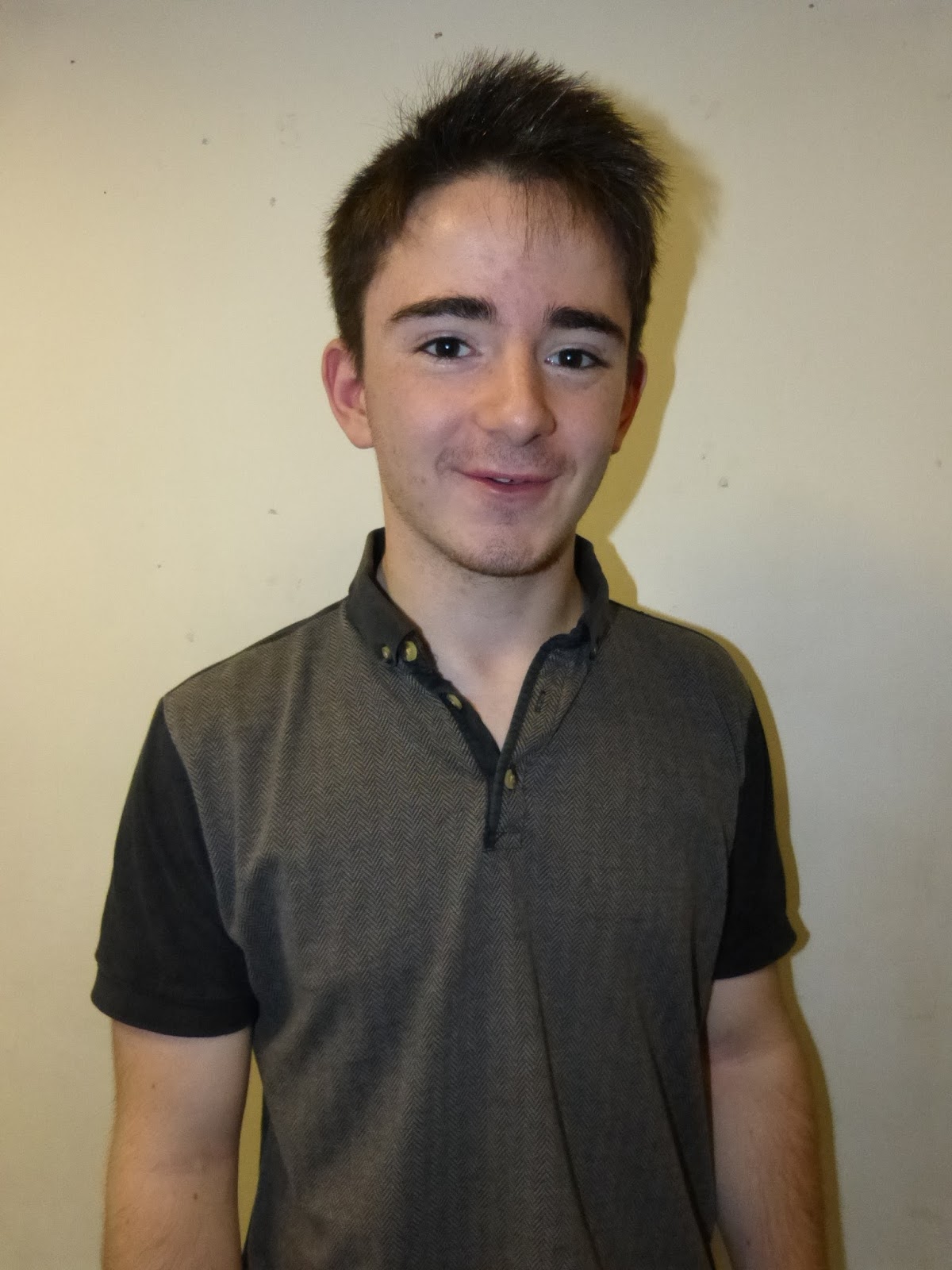
This next shot is my favourite one of the three and I think it was because I experimented with the flash. Kyle's face looks so much brighter and friendly, making it catch other students eye. By having him smile it is a natural way to connect him with the audience (other students at the 6th Form) as well as having direct eye contact with the lens which shown he is a proud Brigg Sixth Form student.The medium close up is a perfect angle since it isn't really as intimidating as a close up but still grabs the audiences attention unlike a far away shot.
The background looks much warmer with the flash as well since it looks more creme than the chilling grey in the first photo. But there is a shadow in the background which takes away the dimension and direction which I was going for for my cover.

In this photo Kyle is seen holding the textbook again and for the same reason I used it in the first picture I wanted to focus on the education at 6th form rather than sports or music. However this limits the variety of coverlines to only education based stories to appeal to the target audience. This is why I believe the previous photo would be best suited for my cover because it is open to interpretation since he hasn't used a prop.
In the photo to the left Kyle's face is too dark and it looks very unprofessional where as in the above shot it is very well lit and would work well when applying a bright masthead and coverlines.
No comments:
Post a Comment