
Friday, 30 September 2016
Research: Front Cover 3 (Billboard Kenny Chesney)

Although not a magazine which constantly features county stars Kenny Chesney models the cover of Billboard's June 2nd 2012 issue.
Masthead
 The Billboard Masthead is an iconic part of its brand with its colourful, filled-in letters. In my opinion this isn't exactly the ideal font for a country music magazine (since it isn't), it reminds me of more of a modern surfer style cover, so it doesn't really create much synergy in terms of the country genre and music. Once again, this is a perfect example of layering with the masthead behind the singer. It works really well with Billboard since it is such a recognisable logo. It is written in sans serif and is located at the top of the cover to give off a modern look in order to appeal to younger audiences, as well as being easily recognisable on a magazine rack.
Image

 As one of the most famous country music artists, Kenny Chesney is known for singing relaxed, tropical kind of songs and his facial expression gives off this kind of vibe by giving a slight smirk. Green's Female Gaze Theory does not apply here because as an artist Chesney is not sexualised in the media, like for example Kip Moore (shown to the right) with his tie undone appearing more seductive. Chesney's smirk could relate to the quote located above his left shoulder "I can take my index finger and make 60,000 move left or right" since he looks confident and comfortable wit himself. I like how the natural lighting of the sun in the background reflects off him in this medium-close up and creates a very natural, down to earth look which I think it represents him as an artist very well. Billboard does a great job of representing artist's images throughout their covers and articles which works well for both the star and Billboard as a company because by having a wide variety of artists Billboard expands their target audience as well as the artist getting more publicity. The cowboy hat is quite an obvious code in reference to the conventions of a Country Music magazine which would instantly be an indicator to whether or not someone would be interested in buying this magazine.
Fonts and Texts


 Unlike the Classic Rock magazine featuring Dolly Parton, Billboard have used a few cover stories in order to inform their audience about what's inside. The boldest font on the page is used on the cover story which is titled "Stadium King". The leading on these words makes the magazine look modern and neatly presented which triggers audiences to be interested in it. The creators of this Billboard cover aligned the "I's" up which probably required stretching one of the words a bit in order for it to fit neatly. Instead of using a "lure word" to make the reader want to know what's inside, there is a "+" sign before the secondary lead "the 67 albums and tours that will bring the heat". This is further evidence that it could be addressed to a younger target audience since it looks a bit like text language. The quote next to Chesney is written in a serif font which looks a bit like Times New Roman. Although I usually think serif looks more dated, by having the quote written in a different style to the rest of it, it draws attention to itself. The red and black colours are usually used together as a convention of Rock music so it breaks the mainstream country feeling by doing this. I also think it's a clever idea that by covering the only blue letter used in the Billboard logo they created the colour scheme of red, black and yellow.
I like how above the masthead they put in a box-out recognising The Beach Boys and their 50th anniversary. The golden yellow works around the whole idea that this is a summer issue as well as using key words such as "sunshine, summer and heat".
Why this has influenced my ideas:
- I really like how the "I's" in stadium king are red and joined together.
- I love the quote and how it matches his facial expression.
- I like the rural background and how it is blurred.
- The lighting in this shot is very nice and doesn't look difficult to replicate.
Country Music Magazine Idea
Ideas for a Modern Country Music Magazine
I've decided that the best genre for my music magazine is Country and Western since I have a lot of props and costumes which would be perfect for the photos as well as being an avid country music fan. By knowing a lot about Country artists it will help me to produce a number of cover stories and a great secondary lead. By being a western style horse rider I have some cowboy boots which fit one of my models so they would be ideal for a down-to-earth photo, and if I want to do more of a glamourous photo shoot, I have some different boots shown below. I have chosen three models who are all comfortable with me doing their makeup and taking pictures of them, however the are all female which could be an issue if I wanted a female target audience. I would have to find a male model who would be comfortable supporting Green's female gaze theory.
Location-wise I know a field where my horses are at which could work very well if I brought my banjo and guitar for my models to hold. By combining the instruments with the horses in the distance I think the mise-en-scene would make the perfect Country Music setting.
Research: Front Cover 2 (Classic Rock's Country Edition Dolly Parton)

Masthead and Fonts

 Classic Rock made a Country feature magazine and included its logo in the top left hand corner. To identify the genre they made the masthead cover 1/4 of the page at the very top. Sans serif is used since it is a convention of Country music and makes it stand out on the page. The black colour also contributes to making it stand out with the thin grey text in the middle of the black one. This could either be two separate fonts layered on top of each other or just a single font, however if they're different, the thinner grey text that sits in the middle of the bold black text would've had to have a wider kerning than the black in order for it to fit. Also if you had a quick flip through the magazine you could tell that the house style is very apparent. Despite the convention of the black and white block text running throughout the contents and pages of the magazine (matching with the masthead) this doesn't match the font of Dolly Parton's name, challenging he synergy of the magazine. Dolly Parton has her own classic style that is recognisable worldwide. She is a bubbly woman with a fun personality (despite the stereotypes of an older woman, challenging Perkin's theory "stereotypes are not simple") which helps her connect with younger generations as well as an audience of her own age. This shines through in the curly serif font used to illustrate her name. The text is in white and contains many curls because it seems that Classic Rock really wanted Dolly Parton to be the primary focus of the magazine.
Image
 Dolly is quite obviously the centre on attention in this studio shot thus adhering to her image. Dyer's theory suggests that "A star is an image not a real person" but in this case I strongly disagree. Her own personal image is the image that sells since the audience like it so much. It would be unnecessary for her to morph herself into a star since how she is already what people like seeing. This is shown in her cover photo whilst she is wearing a rhinestoned covered blouse. In pictures that paparazzi take of her she always looks very glamourous and well groomed. Any colour that she wore was bound to stand out since the studio background is a pastel grey colour. The many jewels on her outfit are very eye catching are help draw the audience in. In my opinion Dolly's face is heavily made up and airbrushed in order to make her appear younger and more attractive to the audience. If you look at her hand it is a different colour and is a lot more aged compared to her face and neck. As well as this she is standing in a position which exentuates her figure and enhanced breasts. This comply's to Mulvey's male gaze theory by making her look more appealing to the male audience. Another conventional code which is used for widely renowned magazines is covering the masthead with the main image this further highlights the importance of Dolly Parton in this issue. It would probably be a really good idea to have my model wear some type of bright or sparkly clothing in order for them to stand out like Dolly Parton did. It would make a huge statement for the star as well as the getting a lot of attention for the magazine.
Cover Stories
 Unusually there is only one cover story which leaves a lot to the imagination when it comes to the contents of this magazine. Breaking conventions like this really highlights how famous Dolly Parton is and how she can sell a magazine by standing alone with a single quote at the top of the page "I love Country Music, I like to think that I've contributed a lot to it". There isn't even a title when it comes to the feature since Dolly Parton is basically the face of classic country music herself.
Pugs and Puffs
 This small pug at the bottom left of the page contains a conventional barcode and a logo of a company called "Team Rock". By doing some research I found out that it specifically publishes rock and metal magazines which is highly unconventional for such a dedicated country singer like Dolly Parton to be associated with. However, since it is a special, they still produced the magazine and is therefore still on the cover. Classic Rock releases an abundance of special features in order to keep their audiences fresh and to make their name well knows between genres. There are also no puffs or advertisements.
Why this has influences my ideas:
- I love the font used for Dolly Parton's name.
- I really like how the photo is covering the masthead.
- I also like the extravagance of her outfit.
Friday, 23 September 2016

Research: Front Cover 1 (Q Magazine: Daft Punk)
Q Magazine: Daft Punk

 This morning I spent some time analysing a variety of magazine covers and this one was my by far the most interesting. Q Magazine adheres to many of the conventions of a classic magazine cover with the trademark masthead and buzzwords. However what interested me was how they interpreted Daft Punks image through the cover story by writing in capitals "UNMASKED". This immediately interests the audience since Daft Punk's faces are constantly covered. By being so hidden it not only emits mystery but also makes their fans quite sceptical of what their true identity is. All of these indexical signs point towards the meaning of their image and style. Questions are consistently being asked. What do they really look like? Why don't they want us to see their faces? Who are Daft Punk? Q cleverly announces that they have the backstory of what makes the group so special which makes the magazines sell. In relation to Dyers Theory "A star is a image not an real person that is constructed" it adheres to his quote since Daft punk would most likely not be walking around the streets with their families wearing a full body robot costume looking like they've just dropped out of a spaceship. This probably works in their favour as well since it keeps their personal life and their professional life separate.
Q Magazine is one of the most well known music magazines around and although not the best example they are able to partially cover their masthead without it being unrecognisable. Although this wont be ideal for my own magazine since it wont be internationally famous it is still a great way for Q to establish their superiority in the media industry.


Q continues to use their signature "blood red" colour scheme within their feature story titles and key words. This is continued on every page throughout the magazine in order to develop a theme and to easily direct readers to the pictures and stories they want to see.
Wednesday, 21 September 2016

Monday, 19 September 2016

Preliminary Task: College Magazine Front Cover
I've finally finished my 6th form magazine! I've posted the screenshot of my final product below.

Preliminary Research: Audience Feedback "Flickr"

Friday, 16 September 2016
Codes and Conventions
Codes and Conventions Final from IndyaConway
We've been learning about what codes and conventions are and what they do in a world full of media.
We've been learning about what codes and conventions are and what they do in a world full of media.
Preliminary Task: Selection and Rejection
This morning I had to choose a model and a backdrop for the cover of my preliminary magazine cover. I decided to choose Kyle, a well known and intelligent student around the campus, because since he is recognisable throughout school and people will be more likely to buy a magazine that he is involved in.

In this photo I got Kyle to read a textbook in order for my cover to look more academic, however it isn't very engaging to the audience due to the lack of eye contact with the camera. In my opinion the lighting is also too dark as the textbook is brighter than my model which isn't the image I am looking for since I wanted Kyle's face to be the centre of attention.
When I was looking for a location for the photo shoot I wanted a blank background because I thought that it would look better with a range of colour and font styles. Despite being my ideal background, I did not position my model correctly and my camera wasn't perfectly vertical so the frame of the door which Kyle was stood next to was slightly in the shot.

This next shot is my favourite one of the three and I think it was because I experimented with the flash. Kyle's face looks so much brighter and friendly, making it catch other students eye. By having him smile it is a natural way to connect him with the audience (other students at the 6th Form) as well as having direct eye contact with the lens which shown he is a proud Brigg Sixth Form student.The medium close up is a perfect angle since it isn't really as intimidating as a close up but still grabs the audiences attention unlike a far away shot.
The background looks much warmer with the flash as well since it looks more creme than the chilling grey in the first photo. But there is a shadow in the background which takes away the dimension and direction which I was going for for my cover.

In this photo Kyle is seen holding the textbook again and for the same reason I used it in the first picture I wanted to focus on the education at 6th form rather than sports or music. However this limits the variety of coverlines to only education based stories to appeal to the target audience. This is why I believe the previous photo would be best suited for my cover because it is open to interpretation since he hasn't used a prop.
In the photo to the left Kyle's face is too dark and it looks very unprofessional where as in the above shot it is very well lit and would work well when applying a bright masthead and coverlines.

In this photo I got Kyle to read a textbook in order for my cover to look more academic, however it isn't very engaging to the audience due to the lack of eye contact with the camera. In my opinion the lighting is also too dark as the textbook is brighter than my model which isn't the image I am looking for since I wanted Kyle's face to be the centre of attention.
When I was looking for a location for the photo shoot I wanted a blank background because I thought that it would look better with a range of colour and font styles. Despite being my ideal background, I did not position my model correctly and my camera wasn't perfectly vertical so the frame of the door which Kyle was stood next to was slightly in the shot.
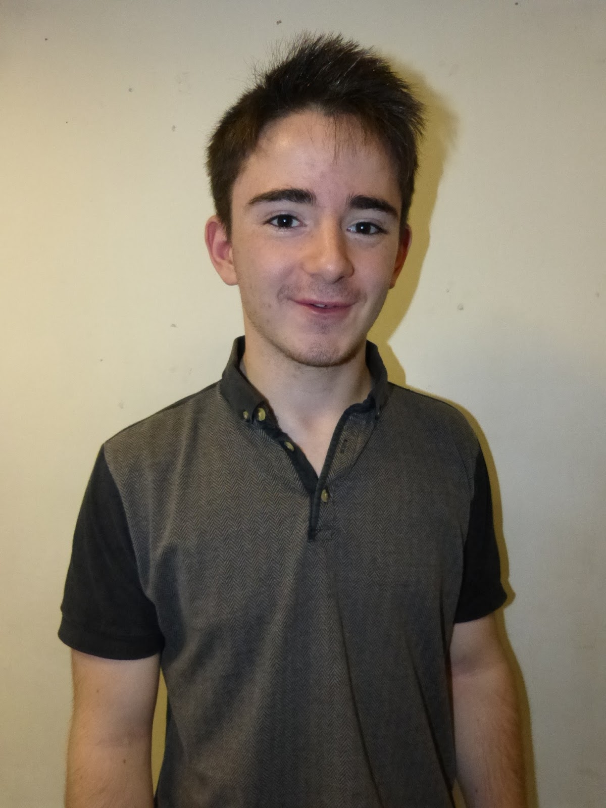
This next shot is my favourite one of the three and I think it was because I experimented with the flash. Kyle's face looks so much brighter and friendly, making it catch other students eye. By having him smile it is a natural way to connect him with the audience (other students at the 6th Form) as well as having direct eye contact with the lens which shown he is a proud Brigg Sixth Form student.The medium close up is a perfect angle since it isn't really as intimidating as a close up but still grabs the audiences attention unlike a far away shot.
The background looks much warmer with the flash as well since it looks more creme than the chilling grey in the first photo. But there is a shadow in the background which takes away the dimension and direction which I was going for for my cover.

In this photo Kyle is seen holding the textbook again and for the same reason I used it in the first picture I wanted to focus on the education at 6th form rather than sports or music. However this limits the variety of coverlines to only education based stories to appeal to the target audience. This is why I believe the previous photo would be best suited for my cover because it is open to interpretation since he hasn't used a prop.
In the photo to the left Kyle's face is too dark and it looks very unprofessional where as in the above shot it is very well lit and would work well when applying a bright masthead and coverlines.
Friday, 9 September 2016
Similar Product Research - Representations

Earlier on this morning I went to my local Supermarket and I thought that I should go and have a look at a few of the magazines to get some inspiration for my own. This Vogue magazine cover instantly grabbed my attention with its bright masthead and shapely font. A cover like this would definitely appeal to my target audience as its headings are straight to the point (which teenagers tend to appreciate since they won't have to waste lot of time finding out what is actually in the contents of the magazine), as well as focusing on the more appareling topics highlighted with larger font. It features a Victoria Beckham, a beautiful and very famous fashion designer. I love the way she is presented, as a modern, independent woman with her eyes staring directly into the camera and her leg slightly showing. The position of her hands also struck me and I automatically assumed this magazine was high fashion even though Vogue is well renowned for their style columns.
AMERICAN SONGWRITER
 |

I really wanted to analyze another type of magazine besides one of the two I had already used, but when I saw this cover I had to write about it. This is definitely my favourite, from the full body shot, showing off her decorative gown, to the way the masthead is in the background making it appear almost 3D. Since this was an online edition of the magazine there is no barcode, instead they have a click to shop button. I think its brilliant that they put a pun in one of the cover lines where it says "Fashion's new wave" as Rihanna is stepping out of a lake. Her dress is covered top to toe in sequins and in my opinion is almost mermaid like. The dress is of similar color and style to the one in the music video for her hit song Work symbolizing her own sense of style and image showing though in her photo shoots. Each of the cover lines are shown in bold with a short description of what that article is about and I think that this is a great idea since there isn't too much writing so that readers won't look at it but there is just enough to give them an insight into what they would read about.
How this has influenced my ideas and learning:
- The clever language used in the titles of the stories are fun and make it more interesting to read.
- I like how there are a lot of things going on within all three magazines.
- The colour schemes make them look nicely presented.
Cross Media Convergence Bauer
Bauer is an internationally knows European-based media company with headquarters in Hamburg, Germany. While it is predominantly recognized in the UK for having a massive portfolio of brands including Land Rover, Kerrang, Heat, Viking Radio, Sea Angler and even Grazia, Bauer Media is "The UK's Most Influential Media Brand Network"


In order to make it easier for internet users to find the magazine that is right for them Bauer Media has cleverly made the "Audience Finder" tool where its potential customers can find out which magazine they would be most interested in depending on the age and gender.

One of the most interesting advertising techniques of Bauer Media for me was with their McVities case study. They went though a lot of research and found out the precise times of day in which people experience "lows" and may need to find a way to "brighten up their brew(s)". This is when they allocated a moment in the day for people to make it a kind of tradition to enjoy their McVities biscuit. By scheduling a time (11am) in their consumers routine to stop everything and take a break created a structure in their daily routine where they were almost made to buy and eat their biscuits, however this benefited both the consumer mutually (as seen in the image below). Over a period of many months, websites were constructed; and magazines and digital activity complemented radio broadcasts, soon every keen tea drinker knew about "Dunk Time" and were hooked on the idea of giving their morning a "boost". This just goes to show that all of the advertising and media coverage Bauer managed to get for the awareness of "Dunk time" helps increase sales of major companies.

Response to OCR G321 Brief
For this brief I'm going to hopefully interpret original ideas and display them in my photos. I'm excited to be working around the theme of music since I used to take GCSE music and I feel like it is a strong subject of mine where I can use my knowledge to my advantage. It will be a fun project where I can be super creative in how I illustrate my ideas for the magazine cover and the double page spread.
OCR G321 Print Brief
Preliminary exercise: using DTP and an image manipulation program, produce the front page of a new school/ college magazine, featuring a photograph of a student in medium close-up plus some appropriately laid-out text and a masthead. Additionally candidates must produce a DTP mock-up of the layout of the contents page to demonstrate their grasp of the program.
Main: the front page, contents a double page spread of a new music magazine.
Main: the front page, contents a double page spread of a new music magazine.
Subscribe to:
Comments (Atom)